The Mistake of Choosing the Wrong Neutral Undertones
One of the first pitfalls people encounter when searching for neutral minimalist small living room ideas is picking paint colors that clash with the rest of the open space. A cream that looks warm in the can might turn greenish under your dining area lights. I have seen soft taupe appear muddy next to a gray sofa. The fix is to test your top three neutral shades on large poster boards and move them around the living room and dining zone at different times of day. A warm gray with a slight beige undertone (sometimes called greige) usually bridges both areas without fighting each other. Remember that natural light changes everything, so live with the samples for a weekend before committing.
A second subtle error is assuming all whites are alike. Pure white can feel stark and clinical in a small open concept room, especially if you have white baseboards and white furniture. Instead, try an off-white with a whisper of cream or warm gray. Brands like Benjamin Moore and Sherwin Williams have specific “warm white” collections that keep the space bright without the sterile vibe. Pairing that wall color with oak floors or linen curtains gives the room a softness that pure white never can.
Open Concept Living Dining Room Layout Mistakes That Ruin Flow
An open concept living dining room combination requires careful visual separation without physical walls. One common layout error is pushing all the furniture against the walls. That leaves a vast empty center that feels like a dance floor and makes the whole room feel smaller. Instead, pull the sofa a few feet away from the wall to define the living zone, and place the dining table at a slight angle or centered in its own visual rectangle. Use a low console table behind the sofa as a subtle divider. This trick creates two distinct rooms within one footprint without blocking the sight line.
Another flow killer is mismatched ceiling heights or lighting fixtures. If your dining area has a pendant light that hangs too low, it visually chops the space. Keep all lighting at the same height or use a linear suspension that spans both zones. Rugs also need careful coordination. A rug that is too small under the sofa makes the living area feel like a postage stamp, while a tiny dining rug leaves the table isolated. Choose a large living room rug that anchors the sofa and coffee table, and a separate dining rug that extends at least 24 inches past the table edges on all sides.
- Tip: Use the same floor color throughout to avoid a visible break that makes the room look disjointed.
- Tip: Keep the eye level consistent by hanging art at the same height in both zones.
- Tip: Consider a room divider made of open shelving – it stores items while letting light pass through.
Overloading with Furniture Creates a Cluttered Vibe
When people want a modern minimalist look they often buy too many pieces, thinking more furniture equals more function. In a small living room with an adjoining dining area, every item must earn its square footage. I see so many oversized sectionals that swallow the living room, leaving no walking path to the dining table. Instead, choose a slim sofa with clean lines (a two-seater or a compact three-seater) and pair it with an airy coffee table that has open legs. For dining, a round or oval table takes up less visual space than a rectangle and makes conversation easier.
Another mistake is stacking multiple accent chairs or ottomans that become seating clutter. Keep it simple: one lounge chair if you have room, and skip the ottoman unless it doubles as storage. The goal is to have at least 18 inches of clear space around the dining table for chairs to pull out, and a clear path from the kitchen to the living window. If you cannot walk through comfortably, you have too much furniture. A good rule is to remove one piece after you think the room is done – then see if you miss it.
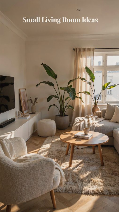
Forgetting Texture Makes a Neutral Room Feel Flat
A palette of cream, taupe, and warm gray can look like a doctor’s waiting room if there is no texture. I have walked into beautiful neutral minimalist living rooms that felt lifeless because every surface was smooth and matte. The secret to making those colors sing is layering natural materials. Add a chunky knit throw on the sofa, a sisal or jute rug under the coffee table, and linen curtains that catch the light. Oak wood in the dining chairs or a raw-edge dining table introduces warmth that paint alone cannot provide.
Do not stop at textiles. Consider a textured wall finish such as limewash or a subtle grasscloth wallpaper on one accent wall. Even your decor items should have varying surfaces: a ceramic vase next to a wicker basket, a stone-look coaster set, a wooden sculpture. Each texture catches the light differently, which keeps the eye moving and makes the square footage feel larger. If you are unsure, stick to three texture categories: soft (linen, wool), rough (jute, wood), and smooth (ceramic, glass). That combination never fails.
Poor Lighting Choices Undermine the Minimalist Feel
Lighting for a neutral minimalist open concept room is often an afterthought, yet it can make or break the entire look. A single overhead fixture that casts harsh shadows will exaggerate clutter and make the room feel cramped. Instead, layer three types of light: ambient (soft overhead), task (a floor lamp by the sofa, a pendant over the dining table), and accent (a small spotlight on a plant or art piece). In a small space, warm light bulbs (2700K to 3000K) are essential – cool bulbs make cream look gray and taupe look dirty.
Another common mistake is placing the dining pendant light off-center. The fixture should hang directly above the center of the table, not above a chair. If your table is round, a single pendant works well; for rectangular tables, consider a linear gold or black fixture that matches the warm tones. Avoid recessed cans that create a grid of light in the living area – they break the ceiling into a checkerboard. Instead, use track lighting or a flush mount with a diffuser to keep the ceiling smooth and uncluttered.
Neglecting Storage Creates Visual Noise
Even the most carefully curated neutral minimalist small living room ideas fall apart when clutter creeps in. Open plan living means everything in both zones is visible at once. A pile of mail on the dining table or a stack of magazines near the sofa instantly makes the room feel messy. The mistake is not having enough closed storage. A media console with doors, a sideboard with baskets, and a coffee table with a lift-top or drawer can hide the everyday items that accumulate.
I recommend one dedicated storage piece per zone. In the living area, a slim cabinet or a built-in shelf unit with doors prevents remote controls and cables from taking over. In the dining area, a buffet or a credenza stores placemats, extra napkins, and serving dishes. Use baskets or lidded boxes inside open shelving so the eye sees a uniform texture rather than random objects. If you have a wall that runs between the two zones, install floor-to-ceiling shallow shelves with a mix of closed and open compartments – that adds storage without encroaching on the floor plan.
Using Too Many Small Decorative Items Clutters the Eye
Minimalism does not mean zero decor, but a common mistake is scattering dozens of tiny objects across surfaces. A coffee table with five small candles, three coasters, a mini plant, and a remote caddy looks busy. The same dining table with a cluster of salt and pepper shakers, a small vase, and a placemat holder feels chaotic. Instead, edit ruthlessly. Choose one or two larger statement pieces per surface: a substantial ceramic bowl on the coffee table, a single tall vase with dried grasses on the dining table. That gives the eye a place to rest.
If you want to display a collection, group them on a tray or a small shelf to keep them contained. For wall art, go for fewer but larger pieces rather than a gallery wall of small frames. A single large abstract painting or a set of two matching prints creates calm and focuses attention. Remember, every extra item requires the brain to process it. In a small open concept space, less visual information makes the room feel bigger and more relaxing.
Creating a neutral minimalist small living room combined with an open dining area does not have to be tricky. By avoiding these common mistakes around undertones, layout, furniture quantity, texture, lighting, storage, and decor, you can achieve a space that feels both spacious and serene. Take it one step at a time – start with the paint color, then adjust the furniture placement, and finally layer in those natural textures. Your home will thank you.
I would love to hear which of these mistakes you have encountered in your own project. Leave a comment below or save this article to your Pinterest board so you can refer back to it later. Happy decorating!
#smalllivingroomideas #neutrallivingroom #modernminimalist #livingroomdining #minimalisthome