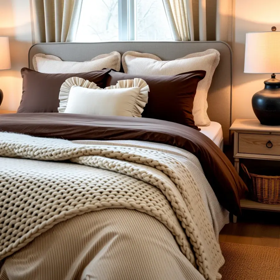
Throw blanket styling is one of those small details that can completely change how your bedroom feels, but it is also surprisingly easy to mess up. I have seen so many beautiful blankets end up looking like an afterthought, or worse, an eyesore. The good news is that most of these mistakes are simple to fix once you know what to look for. Here are the common pitfalls I have run into (and helped friends avoid) when trying to get that cozy, layered bed look with neutral boho decor. Let us save you the trial and error.
Mistake 1: Picking the Wrong Fabric (Ignoring Texture Contrast)
I once bought a gorgeous cream-colored linen throw because it looked soft in the store. But when I placed it on my white cotton duvet, it just disappeared. There was zero visual interest. The number one mistake people make is choosing a throw that is too similar in texture to their existing bedding. If you have a smooth percale sheet set and a flat cotton duvet, adding a smooth cotton throw will do nothing for your layered bed look.
Instead, think about contrast. Chunky knits, chunky cable knits, soft faux fur, or woven wool work beautifully against crisp linen or cotton. In a neutral boho space, I love pairing a thick cream-colored knit throw with a linen duvet in a slightly warmer tone like oatmeal or sand. The difference in texture makes each layer stand out even when all the colors are muted.
For a quick reference, here are fabric combos that always add depth:
- Linen duvet + chunky knit throw
- Cotton sateen + faux fur or sherpa
- Quilted coverlet + lightweight woven cotton throw
- Velvet duvet + flat-weave linen or cotton throw
Mistake 2: Choosing a Throw That Clashes Instead of Complements
Neutral boho decor is forgiving, but it is not a free pass. I have seen people grab a gray throw because it felt neutral, only to realize it looks cold and uninviting next to warm wood tones and beige walls. The mistake is ignoring the undertones of your room. A throw with cool gray undertones can fight with a bedroom that has warm terracotta, sandy beige, or cream tones.
Stick with the same color family but vary the shades. For a calm boho look, a palette of cream, beige, taupe, soft mushroom, and very light blush or clay works wonderfully. If you want a pop of color, consider a muted rust or sage green throw instead of something bright or saturated. The goal is cohesion, not contrast for contrast’s sake. Check the throw against your pillowcases and duvet in natural light before you commit.
Mistake 3: Over-Layering or Under-Layering the Blanket
I used to think more blankets meant more cozy. So I would pile on a quilt, a throw, and another throw, and my bed looked like a messy laundry pile. On the flip side, some people drape one thin throw perfectly straight and it looks staged, not lived in. Finding the sweet spot matters. For a layered bed that feels inviting, you usually want three main layers: a base (fitted sheet and duvet or comforter), a mid layer (a quilt or coverlet folded at the foot), and then the throw blanket as the top accent.
The throw should not be competing with the mid layer. If you already have a heavy quilt at the foot, choose a lighter, airier throw like a linen or lightweight cotton. If your mid layer is a thin coverlet, a chunky knit throw adds the right amount of heft. Also, avoid having the throw fully cover the mid layer. It should sit at an angle, draped over one corner or folded across the bottom third of the bed. This creates a deliberate, styled look without looking overdone.
Mistake 4: Neglecting the Fold and Drape Technique
How you place the throw is almost as important as which throw you pick. I have seen a beautiful chunky knit blanket just dropped in the middle of the bed, looking like a messy pile. A neatly folded square at the end of the bed can feel too stiff. The trick is to fold the throw in half lengthwise, then drape it diagonally across the foot of the bed, letting one end hang longer than the other. For a smaller bed like a twin or full, fold it in thirds and place it horizontally across the foot, letting the ends overlap the sides by a few inches.
Another approach is to fold it into a rectangle and lay it across the bottom quarter of the bed, then tuck the ends slightly under the mattress or the duvet. This keeps it in place and creates a clean line. For a more relaxed boho feel, you can casually toss one corner over and let it wrinkle a little. The key is intention. Play with the drape until it looks effortless but deliberate.
Mistake 5: Ignoring Scale and Proportion of the Throw
A throw blanket that is too small for your bed will look like a napkin. A throw that is too large can overwhelm the whole layout. I have a king bed, and a standard 50×60 inch throw looks ridiculously tiny at the foot. For a king or queen, look for throws that are at least 60×80 inches, or even oversized throws that measure 60×90. For a twin or full bed, a 50×70 inch throw is usually a better fit. If you are using the throw as a top layer that covers more area, go bigger. If it is purely decorative at the foot, you can size down slightly but never below 50×60.
Also consider the depth of your mattress. A thicker throw on a deep mattress might need to be larger so it actually drapes over the side. Test it by placing the throw on the bed and stepping back. If it looks like a small accent pillow lost in the duvet, size up. If it swallows the entire end of the bed, size down or fold it more tightly.
Mistake 6: Forgetting the Rest of the Room’s Colors and Patterns
I once helped a friend who had a beautiful cream and beige boho bedroom with macrame wall art and a rattan headboard. She added a throw with a bold geometric pattern in black and white. It stuck out like a sore thumb. The mistake was thinking the throw could be a standalone statement without considering the rug, the curtains, or the accent pillows. Neutral boho decor thrives on subtle repetition of color and texture. If your bedroom has warm tan walls and a rust-colored rug, a throw in a similar rust tone or a warm cream will tie the room together.
A good rule is to pull one color from an existing element in the room, like the rug, a pillow, or even the artwork. If you are using a patterned throw, make sure the colors in the pattern appear somewhere else in the room, even in a small way. For example, a throw with thin tan stripes works well if your curtains are tan. If everything else is solid, a throw with a slight texture like ribbing or a basket weave adds interest without pattern clash. Keep the overall palette limited to three or four neutral shades for the most peaceful look.
So there you have it. Getting throw blanket styling right for your cozy bedroom is mostly about avoiding these six common missteps. Pick the right fabric for texture contrast, choose colors that complement your room’s undertones, layer with purpose, learn a simple drape technique, mind the scale, and connect the throw to the rest of your decor. Once you do, that neutral boho layered bed will look like it belongs in a magazine, but it will still feel like your own. Ready to try it? Start by pulling out the throw you already own and see if any of these mistakes apply. Sometimes a simple fold and a new placement is all it takes.
#ThrowBlanketStyle #BedroomDecor #CozyBedroom #BohoDecor #LayeredBed
Leave a Comment