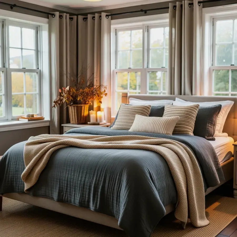
We painted our entire main floor for under a hundred bucks, using mostly Sherwin Williams sample jars. This rustic farmhouse paint palette on a budget started as a panic decision last October, because the wood paneling was making our living room feel like a ski lodge. Turns out you don’t need a designer or a pricey color consultation to get that cozy cottage look. You just need a clear plan, a few test swatches, and maybe an old pizza box to paint on.
Why Sherwin Williams Warm Neutrals for Whole House Work Better Than Trendy Whites
White walls look crisp in bright kitchens and modern lofts, but in a drafty old farmhouse they can feel cold, especially from November through February. Warm neutrals hold the light differently. They wrap a room like a well-worn flannel shirt, not like a bedsheet that’s still in the package.
We used Sherwin Williams warm neutrals for whole house spaces, which is a fancy way of saying we picked one beige family and repeated it everywhere. That’s the trick. Instead of choosing a different white for every room, we let the same soft creamy base flow from the living room into the hallway and right up the stairwell. The result? The house feels bigger, calmer, and honestly a little more expensive than it deserves to.
One warning: not every warm neutral is actually warm. Some paint labeled “greige” pulls blue in certain lighting and will ruin the whole rustic mood. Look for colors with golden or pink undertones, not olive or gray.
How to Use Cheap Paint Samples and Test Swatches Like a Designer
Here’s the thing about sample jars: they don’t have to be tiny swatches stuck to a cardboard card. We bought six different Sherwin Williams samples, each around four bucks, and painted big peeling rectangles directly onto the wall. Designers do this too, just with fancier brushes.
Do yourself a favor and paint on a large area, not a small square. A four inch by four inch patch will lie to you. It blends into the old paint color and tells you nothing. We made that mistake in the hallway and ended up repainting the entire mudroom.
- Accessible Beige for main walls, it’s the safest warm neutral in the whole lineup.
- Kilim Beige for bedrooms and the back hallway, a touch deeper and cozier.
- Cavern Clay for an accent wall in the bathroom, it’s a burnt terracotta that sounds scary but works like magic.
- Urbane Bronze for the front door, because every farmhouse needs one dark, moody statement.
The pizza box trick came from pure laziness. I didn’t want to tape plastic drop cloths down, so I ripped open an old takeout box and used it as a portable palette. It absorbed the paint evenly, let me move around the room holding a piece of the actual color, and I threw it in the recycling when we were done. Honestly, it worked better than any store bought tray.
The Soft Beige Living Room Paint Ideas We Actually Stole From a Hotel
There’s a small inn near my sister’s place where every wall is painted the same soft sand color. It’s not grey, it’s not really tan either. It’s the kind of shade that makes you want to curl up on the couch and cancel your afternoon plans.
For our soft beige living room paint ideas, we copied that exact vibe. The walls are Sherwin Williams Accessible Beige, which reads as a warm greige in the morning and turns honey colored by sunset. Chunky knit throw blankets suddenly look twice as inviting, and the dark wood beams in the ceiling actually stand out instead of disappearing.
If you want extra warmth, pair soft beige walls with a cream colored sofa. Add one deep brown leather chair and a woven jute rug, and you’re basically living inside a fall catalog. The best part is that this doesn’t scream “farmhouse” with buffalo check and barn doors. It’s more subtle, like a cottage that grew up a little. You can always add the rustic touches later, or just leave them out.
Clay Tone Paint Colors for Cottage Bedrooms, Hallways, and Awkward Corners
Clay tones are having a moment, and for once the trend actually survives through winter. Unlike pale pink or sage green, clay colors feel grounded. They have enough red and brown in them to make a room feel like it’s been there forever.
We used Cavern Clay in the half bathroom, which is the smallest room in the house, and it changed everything about that space. The old wall color was a builder grade beige with yellow undertones. It looked like dirty oat milk. One weekend of painting with clay transformed it into the most talked about spot in the house, which sounds ridiculous, but it’s true. People walk in and just stop.
A good rule for clay tones is to keep them out of direct sunlight. In a bright room they can lean orange in a bad, pumpkin spice overkill kind of way. But in a hallway or a room that gets northern light, they become earthy and calm. Also, don’t pair clay with red brick. That combination gets visually loud fast. Pair it with warm white trim and unlacquered brass instead.
A Budget Whole House Color Scheme That Doesn’t Feel Repetitive
One color repeated everywhere sounds boring, but the secret is varying the finish and the depth. Use the same beige on the main walls, then go a shade darker in the bedrooms. Use the same clay tone inside a closet or on a single accent wall. That way the house feels connected without matching perfectly, like a family that shares the same nose but wears totally different outfits.
Our budget whole house color scheme ended up being exactly three colors: Accessible Beige for the main living areas, Kilim Beige for the bedrooms, and Cavern Clay for the bathroom accent. We also painted the interior side of the front door in a deep warm bronze, which costs almost nothing but gave the entryway a huge amount of personality.
If you’re worried about the flow, carry a piece of the paint chip with you as you test colors in different rooms. It’s a cheap, analog way to make sure nothing clashes. And if something doesn’t work, that’s what sample jars are for. You’re not committed until the first full gallon hits the wall.
Seasonal Farmhouse Paint Trends for Winter, Without Repainting Everything
The winter season is when warm neutrals really earn their keep. A lighter beige wall can look blank and sad in December if the room is full of grey furniture, so we lean into layered textures. Wool blankets, leather ottomans, and brass candlesticks do the heavy lifting. The paint is just the backdrop, the quiet canvas underneath.
This year, the seasonal farmhouse paint trends are all about deeper, earthy versions of the usual neutrals. Think mushroom brown, dusty terracotta, and warm taupe. You don’t need to repaint every wall to get in on it. Just switch out your throw pillows or add a clay colored vase on the mantel, and the whole room updates itself.
We’re planning to repaint one wall in the dining nook with a deeper clay tone next month. Not because the current beige is wrong, but because the shorter days make everything feel darker anyway. Might as well lean into it all the way.
So what’s your go-to neutral? If you’ve been staring at the same flat white walls for too long, grab a few Sherwin Williams samples and start with the smallest room. The whole house can wait. That little patch of clay or beige will tell you everything you need to know.
Leave a Comment